My biggest project within Absolute, an Italian company with great developers and a staggering output. An online training courses provider, EPTA, asked us to completely remake their platform.
Absolute seized the opportunity to build a new framework to be reused across similar projects. In fact, we used it right away for the following projects: TripsAround, a travel itinerary maker, and Astrolute, an online astrology platform.
My role
My role consisted in designing the apps themselves and laying out the foundations of the framework. The goal for the framework was improving DX and productivity when building UIs and handling recurring operations. This meant building, among other things:
- Routing and data loading system
- Different layouts
- A good set of mindful components
- Abstraction over CRUD operations
- Frontend tooling
Developing these meant ending up with a nice set of re-usable hooks, tools and helpers, as well.
Design & features
EPTA
EPTA serves one of the largest supermarket chains in Italy, Coop. They needed an admin panel to manage all building blocks of their training platform and the relationships between them. We made a fully cloud-native app running on AWS.
I did’t take risks and went for a clean and functional look, as EPTA employees spend a lot of their time inside these views. We included actions and quick filters for their most commonly used functions.
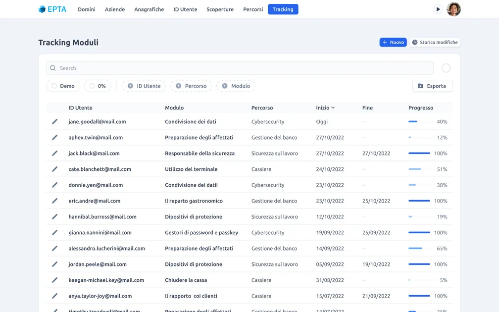
Search view. I de-emphasized secondary information, highlighting in turn the defining columns for each entity. You can filter granularly using some Stripe-inspired filters, or quick filter – for example – by users that have yet to start their course.
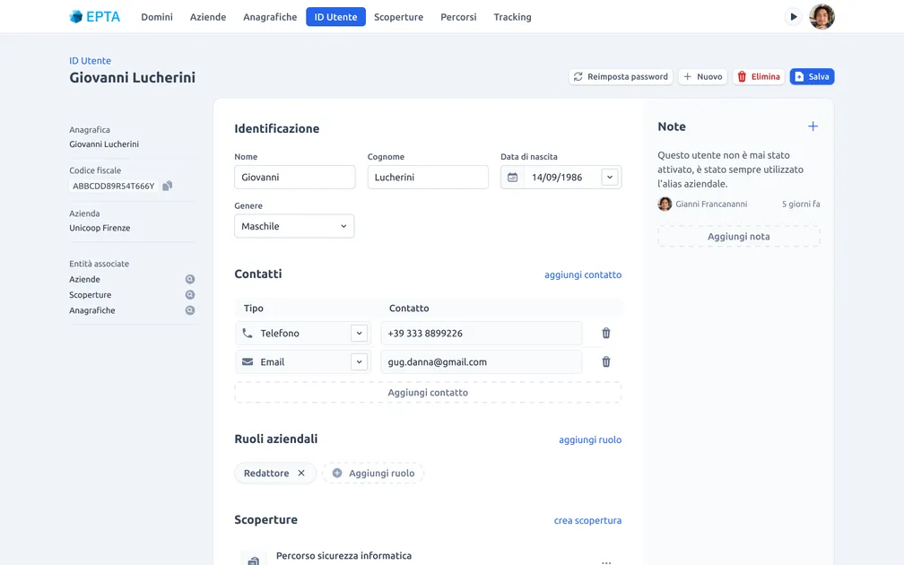
Detail view. First column holds identifying info and owner entities. In the center, the main form and owned entities. On the side, the comments section.
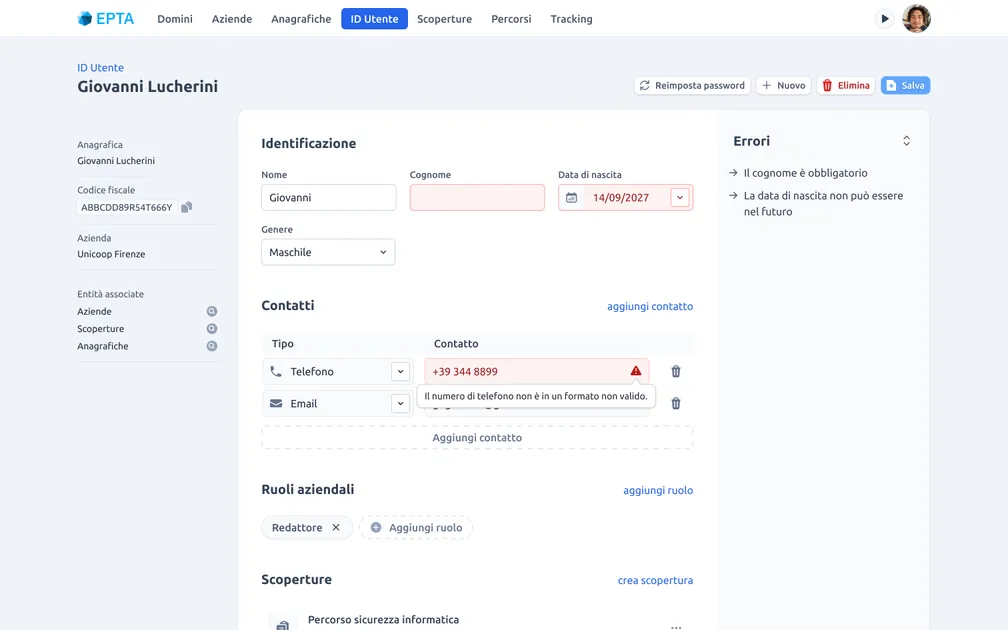
These complex forms have a good chance of erroring back upon submission. That’s why the right column doubles as error space, and some errors are inlined. This keeps content reflow to a minimum, which could be irritating or even nauseating for employees submitting lots and lots of forms each day.
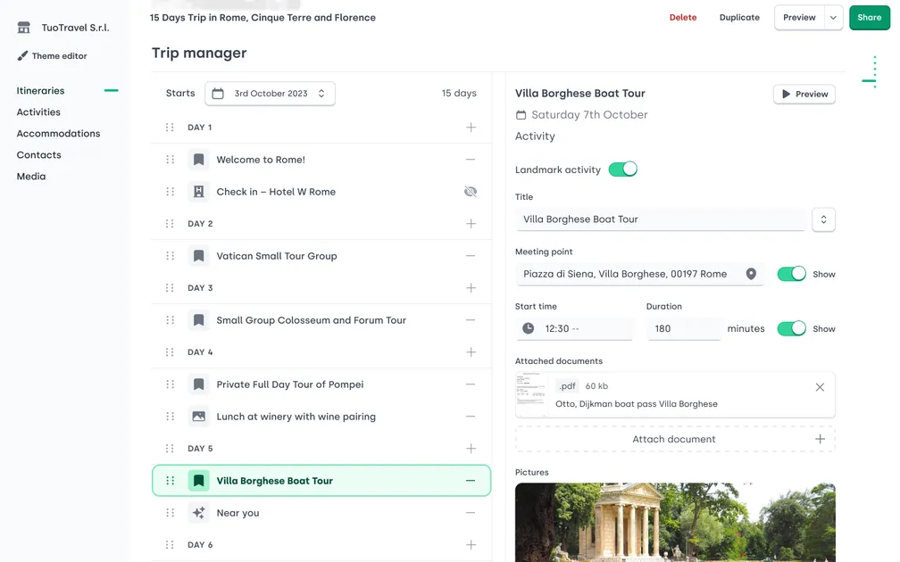
TripsAround
TripsAround is a travel itinerary maker. It also adds location-based, AI-powered suggestions for places and activities. The app live-previews edits within an <iframe> on the client, and then, when publishing, server-side renders the itinerary and stores it on a CDN.
I wanted to do something different with TripsAround’s visual identity, so I went for a Duolingo-inspired, 3D bezel look. This forced me to keep all other borders to a minimum.
The top of the editor, with the live preview open. As most of these
trips will have very similar titles, unique attributes like id, start
date and clients are in the header to distinguish it from other
itineraries.
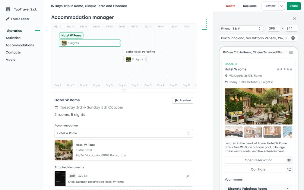
Accommodation manager, with resizable blocks to select the stay or edit its number of nights.

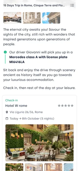
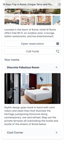


Itinerary mobile views. Important information – such as the driver’s license plate or phone number – is easy to find in the dedicate sections, or clearly highlighted within the itinerary. This way, users can easily find it even on the go or under a strong sun.
Astrolute
Obvious disclaimers about astrology aside, I had lots of fun porting this old-time success of Absolute (think software on CDs) to the web. Yes, they even make this kind of software.
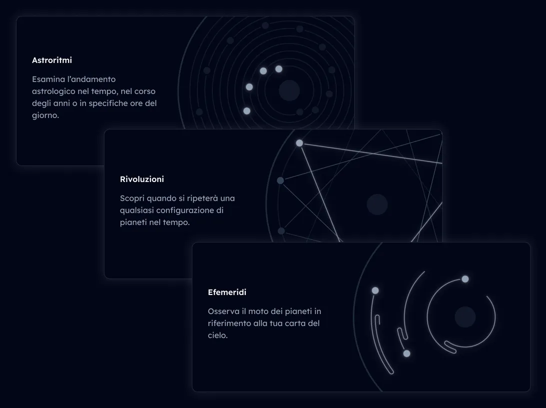
The visual identity aims to evoke constellations and the imaginary lines that connect them. Brightness is the principal mean to show active elements or de-emphasize inactive ones (within the limits of basic accessibility).
Birth horoscope. On the left, filters for planets, signs, aspects, and astrological houses, as well as a birth chart. The chart is densely packed with aspect lines connecting planets. On the right, a list of interpretations and a ribbon to filter them.
Birth horoscope view. Hovering over an interpretation shows its corresponding line on the birth chart. In fact, while researching, I found birth charts to be too crowded. The “base planets” filter is active by default and serves as a small, self-explanatory demo on filters.
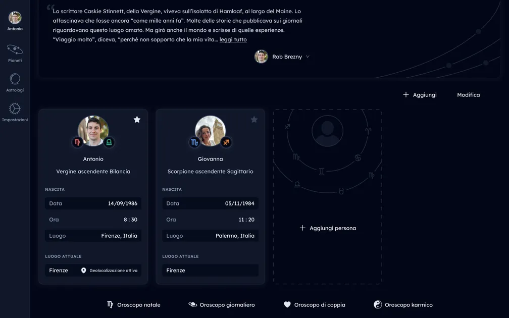
People cards. I clearly listed and labelled all the different app functionalities.

In the ocean of minimalist apps out there, it was nice to experiment with decorated buttons and inputs.

The custom-made icons for the topic filters. They each have a different configuration of dots (stars) inside their paths.
Routes and data
Routes are where UI (components, layouts) and logic (hooks) meet, and they should represent gateways to “slices” of business logic.
Routing and data loading follow Remix’s approach, which in turn owes much to web fundamentals. I fully embraced Remix’s <Outlet /> pattern to keep things DRY.
Accessible demo in progress. Selecting a path, such as (all) `artists` or its subdirectory `artistId` highlights the corresponding piece of UI. Just like the path hierarchy, these pieces of UI are contained with each-other. 'Artists' contains the current selected artist, and so on.

Initial data loading happens in react-router-dom’s loader functions, where TanStack Query – probably the best data fetching library in the React ecosystem – fetches the data.
This way, business logic hooks have their data pre-fetched. Developers don’t need to litter code with flags and conditionals, and users will see the UI only when it’s ready. As a bonus, productivity increases when you don’t need to make every piece of dynamic UI twice – the real UI and the loading skeleton.
In my experience, it takes ages to make a “good” loading skeleton, and yet it’s impossible to avoid reflow when the real thing kicks in. Every time I misclick because of this kind of waterfall, I can’t help but get annoyed – I don’t want my users to experience this.
Routes and layouts
I strive to delegate layout concerns to layout components, while building other components in isolation.
For app shell layout components, I also make use of React portals in order to render to different parts the DOM. Let’s revisit the previous example for a moment. The client now wants the “save” button to be in a different part of the DOM from the one your route outputs to. Through, say, a portal-powered <ButtonSlot />, you can have both your form and the button within the route, without the need to lift up state.
Accessible demo in progress. The same UI of the previous demo, but this time the "save" button for the album, previously within the "album" UI section, is in the "All artists" section.
This way, routes outline logic structure, not UI structure. Route code is collocated, making it clear for the developer what the route does and depends on.
Extensible, composite components
Components are built upon lower-level, headless UI libraries, which also take care of basic accessibility.
The first step is preparing higher-level components – still unstyled. I store them in the core framework library along with basic hooks, utils and helpers.
import * as BaseInput from '@lib/components/input'

export function App() {
    return (
        <Base.Root
            initialValue="2018-07-22"
            type="date"
        >
            <Base.Label>
                Birthday
            </Base.Label>
            <Base.Field />
            <Base.ClearButton />
        </Base.Root>
    )
}
import React from 'react'
import { callAll, isFunction, isDefined } from '../utils'

const InputContext = React.createContext()
InputContext.displayName = 'InputContext'
export const useInput = () => React.useContext(InputContext)

export const Root = React.forwardRef((props, inputRef) => {
    const {
        children,
        initialValue,
        value: controlledValue,
        onChange: providedOnChange,
        onClear: providedOnClear,
        ...rest
    } = props
    const [_value, setValue] = React.useState(initialValue)
    const isControlled = isDefined(controlledValue)

    const value = isControlled ? controlledValue : _value

    const inputId = React.useId()
    const helperId = React.useId()
    const errorMessageId = React.useId()
    const [showPassword, setShowPassword] = React.useState(false)

    const onChange = React.useCallback(
        (event) => {
            if (isControlled) return
            const { value } = event.target
            setValue(value)
        },
        [isControlled]
    )

    const onClear = React.useCallback(() => {
        if (isControlled) return
        setValue('')
    }, [isControlled])

    const inputProps = {
        value,
        onChange: callAll(onChange, providedOnChange),
        id: inputId,
        'aria-describedby': helperId,
        'aria-errormessage': errorMessageId,
        ...rest,
    }

    return (
        <InputContext.Provider
            value={{
                inputProps,
                inputRef,
                inputId,
                onClear: callAll(onClear, providedOnClear),
                helperId,
                errorMessageId,
                showPassword,
                setShowPassword,
            }}
        >
            {children}
        </InputContext.Provider>
    )
})

export const Label = React.forwardRef((props, ref) => {
    const { children, htmlFor: providedHtmlFor, ...rest } = props
    const { inputId } = useInput()
    const htmlFor = providedHtmlFor || inputId
    return (
        <label ref={ref} htmlFor={htmlFor} {...rest}>
            {children}
        </label>
    )
})

export function Field(props) {
    const { className } = props
    const { inputProps, inputRef, showPassword } = useInput()
    const { type, autoComplete, ...rest } = inputProps

    const innerRef = React.useRef(null)
    React.useImperativeHandle(inputRef, () => innerRef.current)

    const _type = showPassword ? 'text' : type
    const _autoComplete = type === 'password' ? 'off' : autoComplete

    // Set `type` to `"password"` programmatically when submitting
    React.useEffect(() => {
        if (type !== 'password') return
        const input = innerRef.current
        const form = input?.form
        if (!input || !form) return
        const onSubmit = () => input.setAttribute('type', 'password')
        form.addEventListener('submit', onSubmit)
        return () => {
            form.removeEventListener('submit', onSubmit)
        }
    }, [type])

    return (
        <input
            className={className}
            ref={innerRef}
            type={_type}
            autoComplete={_autoComplete}
            {...rest}
        />
    )
}

export const ShowPasswordButton = React.forwardRef((props, ref) => {
    const { onClick: providedOnClick, children, ...rest } = props
    const { inputId, showPassword, setShowPassword } = useInput()

    const onClick = React.useCallback(() => {
        setShowPassword((p) => !p)
    }, [setShowPassword])

    return (
        <button
            {...rest}
            ref={ref}
            aria-controls={inputId}
            onClick={callAll(providedOnClick, onClick)}
            type="button"
        >
            {isFunction(children) && children(showPassword)}
            {!isFunction(children) && children}
        </button>
    )
})

export const ClearButton = React.forwardRef((props, ref) => {
    const { onClick: providedOnClick, ...rest } = props
    const { onClear } = useInput()

    return (
        <button
            ref={ref}
            onClick={callAll(providedOnClick, onClear)}
            type="button"
            {...rest}
        />
    )
})

export const Helper = React.forwardRef((props, ref) => {
    const { as = 'p', id: providedId, children, ...rest } = props
    const context = useInput()
    const id = providedId || context.helperId

    return React.createElement(
        as,
        {
            ref,
            id,
            ...rest,
        },
        children
    )
})

export const ErrorMessage = React.forwardRef((props, ref) => {
    const { as = 'p', id: providedId, ...rest } = props
    const context = useInput()
    const id = providedId || context.errorMessageId

    return React.createElement(as, {
        id,
        ref,
        ...rest,
    })
})

Root.displayName = 'Root'
Label.displayName = 'Label'
Helper.displayName = 'Helper'
ShowPasswordButton.displayName = 'ShowPasswordButton'
ClearButton.displayName = 'ClearButton'
ErrorMessage.displayName = 'ErrorMessage'
Consumers lay out and freely swap, customize or extend their parts via composition. They can also interpose other components, as UI logic is shared internally through Context. This way, components are highly customizable while avoiding prop proliferation.
Next, I built their styled counterparts, varying on a project basis.
import * as AstroluteInput from '@components/input'

export function App() {
    return (
        <AstroluteInput.Root
            initialValue="2018-07-22"
            type="date"
        >
            <AstroluteInput.Label>
                Birthday
            </AstroluteInput.Label>
            <AstroluteInput.Field />
            <AstroluteInput.ClearButton />
        </AstroluteInput.Root>
    )
}
import React from 'react'
import * as BaseInput from './base-input'
import Heroicon from '../../heroicon'
import { StarLine } from './star-line/star-line'

export const Root = React.forwardRef((props, ref) => {
    const { children, ...rest } = props

    return (
        <BaseInput.Root ref={ref} {...rest}>
            <div className="relative isolate flex items-center rounded-b-[px] rounded-t-md bg-slate-950 text-base">
                {children}
                <StarLine className="absolute inset-x-0 bottom-0 w-full" />
            </div>
        </BaseInput.Root>
    )
})
Root.displayName = 'Root'

export function Label(props) {
    const { children, ...rest } = props

    return (
        <BaseInput.Label className="px-3 py-2 text-slate-400" {...rest}>
            {children}
        </BaseInput.Label>
    )
}

export function Field(props) {
    return (
        <BaseInput.Field
            className="ml-auto w-0 flex-grow border-none bg-transparent px-3 py-2 text-right text-white placeholder:bg-slate-500 placeholder:bg-transparent placeholder:text-slate-500"
            {...props}
        />
    )
}

export function ClearButton(props) {
    return (
        <BaseInput.ClearButton
            className="px-3 py-2.5 text-slate-100"
            {...props}
        >
            <Heroicon id="mini/x-mark" />
            <span className="sr-only">Clear contents</span>
        </BaseInput.ClearButton>
    )
}

export function SimpleInput(props) {
    const { label, clearButton = false, ...rest } = props
    return (
        <Root {...rest}>
            {label && <Label>Birthday</Label>}
            <Field />
            {clearButton && <ClearButton />}
        </Root>
    )
}
Often-used components may also have a “just-get-it-done” export, with minimal API surface.
import { SimpleInput } from '@components/input.jsx'

export function App() {
    return (
        <SimpleInput
            initialValue="2018-07-22"
            type="date"
            label="birthday"
        />
    )
}
import React from 'react'
import * as BaseInput from './base-input'
import Heroicon from '../../heroicon'
import { StarLine } from './star-line/star-line'

export const Root = React.forwardRef((props, ref) => {
    const { children, ...rest } = props

    return (
        <BaseInput.Root ref={ref} {...rest}>
            <div className="relative isolate flex items-center rounded-b-[px] rounded-t-md bg-slate-950 text-base">
                {children}
                <StarLine className="absolute inset-x-0 bottom-0 w-full" />
            </div>
        </BaseInput.Root>
    )
})
Root.displayName = 'Root'

export function Label(props) {
    const { children, ...rest } = props

    return (
        <BaseInput.Label className="px-3 py-2 text-slate-400" {...rest}>
            {children}
        </BaseInput.Label>
    )
}

export function Field(props) {
    return (
        <BaseInput.Field
            className="ml-auto w-0 flex-grow border-none bg-transparent px-3 py-2 text-right text-white placeholder:bg-slate-500 placeholder:bg-transparent placeholder:text-slate-500"
            {...props}
        />
    )
}

export function ClearButton(props) {
    return (
        <BaseInput.ClearButton
            className="px-3 py-2.5 text-slate-100"
            {...props}
        >
            <Heroicon id="mini/x-mark" />
            <span className="sr-only">Clear contents</span>
        </BaseInput.ClearButton>
    )
}

export function SimpleInput(props) {
    const { label, clearButton = false, ...rest } = props
    return (
        <Root {...rest}>
            {label && <Label>Birthday</Label>}
            <Field />
            {clearButton && <ClearButton />}
        </Root>
    )
}
Hurdles and take-aways
While developing the abstraction for CRUD operations, I initially mistook the requirement to “make the developer do as little as possible”. My abstractions were too rigid, and showed their limits quite quickly.
On the other hand, when designing abstractions to be used in multiple ways, I provided too many. I was not building a library, and made my life difficult for no good reason.
If you strive to write small and – whenever possible – pure, simple functions, you’ll almost surely end up with a neat and easy-to-maintain codebase.
I learned that building a framework is easy. However, building something useful, flexible and easy to understand is hard – it requires practice and real-world use.
Another pain point was being the only designer in the company. Given the scope of the work, I felt overstretched between two fundamental aspects of our industry – design and engineering.
As a minor hurdle, I began to build tooling around esbuild from scratch. While I learned a lot by doing so, in hindsight it was just not worth it. After a while, I switched to Vite and never looked back.
These hurdles compounded when changes had to be relayed across multiple projects, all while colleagues were already using the framework to build UIs.
Still, I’m thankful to the leaders at Absolute for giving me so much trust. I’ve been fortunate to test my work against open-minded and experienced colleagues.