What it is and why I built it
Think of it as a LinkedIn for students, but with the goal to solve two big problems of the job market:
- the skills mismatch between candidates and vacancies
- discrimination during candidate selection
We conceived it as a digital campus where students, educational institutions (universities, HEIs) and employers all hang out. Starting my career with a stake in an ambitious startup that aimed to do good was everything I could have hoped for at the time. I joined as co-founder, first developer, and only designer.
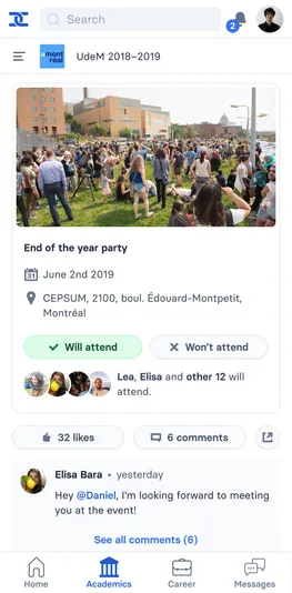

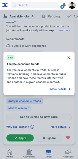
We conceived the social modules of Nxus as a better-feeling Facebook alternative, which is widely used by cohorts to make announcements and share material. Students also browse job offers à la Tinder. Tapping on a skill shows its type, description and possible alternative labels thanks to the ESCO database
Skills mismatch
For students, Nxus is a community and job search tool. For employers, it’s a job board and a candidate scheduling tool. This generates feedback data about which candidates with which skills landed the job. Finally, universities use it to keep in touch with alumni, while faculty managers tokenize learning outcomes for their courses.
This allows for measuring the skills mismatch in real time. This information is accessible to universities that can update their curriculum accordingly. As students completed their study program cycle, we could use that data to inform the next generation of students. This ingenious, closed-loop idea came from Niels Baay, co-founder and CEO.
My first task
My mission was to design and code the frontend of the MVP from scratch. The equipment, my laptop and some nice technical docs put together by a senior software engineer. I read up on books about UI (thank you, “Refactoring UI”!) and code structure, and dove in.
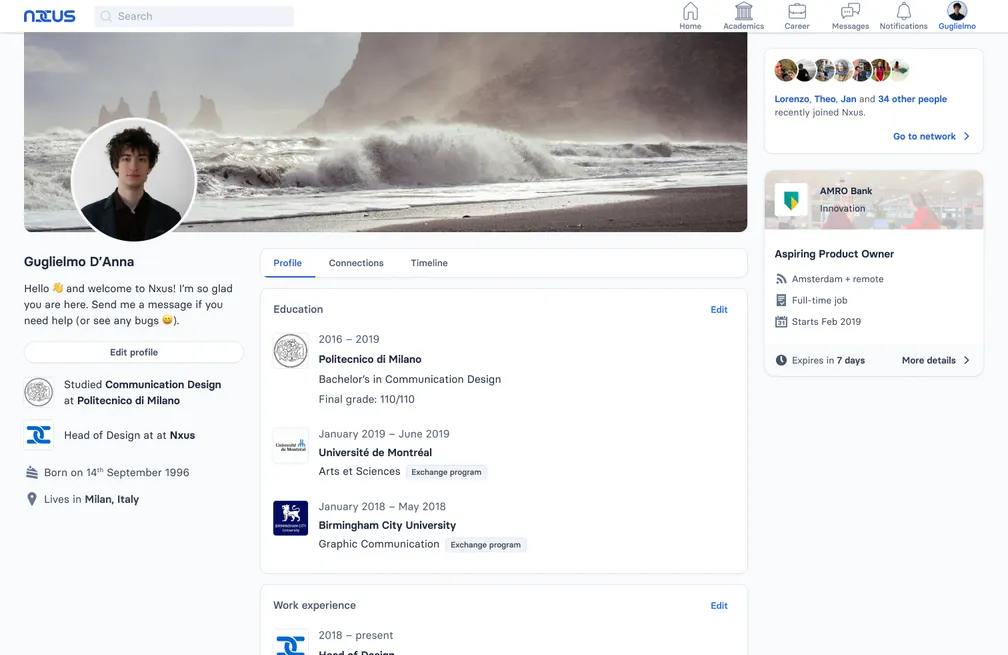
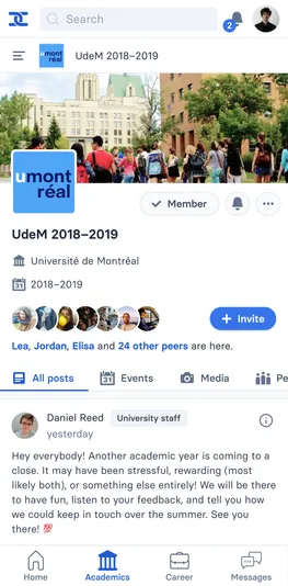
The user profile on desktop, which I designed as hybrid between Github and Facebook. I reserved the typical space on the side for ads and secondary information.
With little design experience, I look at websites I loved, mixing and matching. While the outline was that of an employment-focused social network, like Linkedin, the visual identity owed much to websites like Github, Twitter and Quora. Being short on time (I was finishing my bachelor’s at the time) I coded directly, using a set of color, spacing, type and shadow design tokens.
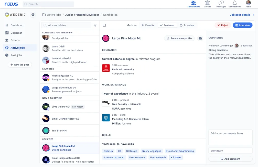
The recruiter admin panel for candidates. Since they haven’t yet scheduled an interview with this candidate, they can’t see the real name or profile picture. They can also access their student profile, where all the personal information has been obscured.
The application became multi-tenant as we onboarded clients and created test environments. CSS custom props came in handy for theming.
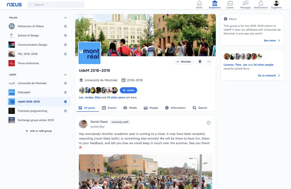
By default, you belong to up to four groups per institution: university (or school), faculty, program and cohort. In this test environment, I used my own university and the exchange university I was attending at the time as sample models.
Recruitment and non-discrimination
Niels came up with anonymising candidates until they get an interview. The idea was to allow women and people of color to get a foot in the door – without having their application discarded (or selected) for the wrong reasons.
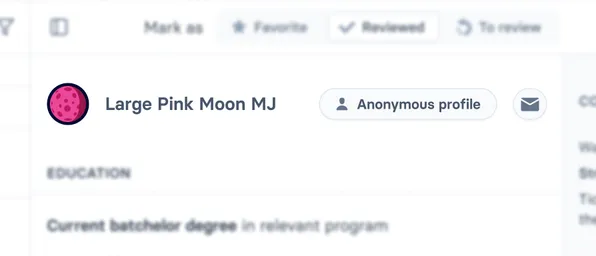
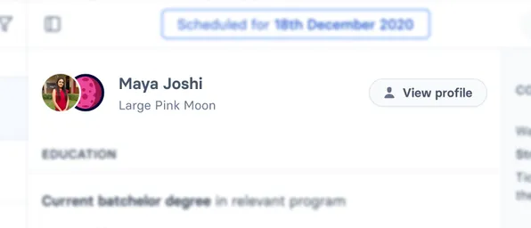
The candidate ID info and how they change before and after the recruiter scheduled an interview date
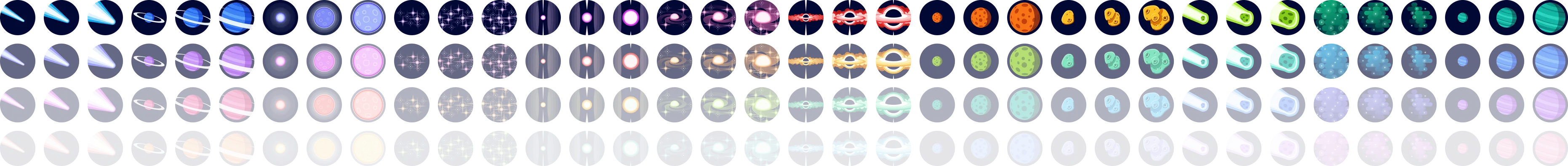
I chimed in with some design thinking. Since it was very difficult for employers to navigate anonymous profiles, I came up with the idea of aliasing them with celestial bodies. Commenting on candidates changed from a “nice-to-have” feature into the core management system.
After some trial (and mostly error) with generative design, I hand made 10 different celestial bodies.


Each of them came in 3 sizes each.


Planets also had “ringed” variations. Together with the fantastic Tailwind palettes, this gave us more than 600 fun and memorable aliases for employers to sift through. Initials were also there to further disambiguate and provide distinction for color-blind people. Plus, it makes candidates look even more like a celestial discovery.
Tech stack
It’s an MVC web app built on Laravel. I used jQuery for interactive parts and some React for complex widgets. I used SMACSS to organize CSS. While I didn’t use Tailwind, I borrowed a lot from it when tokenizing color, typography, spacing and shadow presets into CSS custom props.
Technical hurdles and take-aways
The biggest issue I faced was the classic startup feature proliferation. Lots of things getting done, undone and re-done, while the code gets messier and messier. This taught me two lessons, programming-wise, and made me realize a passion that still inspires me.
The first is iterating quickly and abstracting later, as the need for it arises.
The second is an aspect of this job that I love – DX. It goes beyond the periodical refactor. It’s about using design patterns that make code extensible without changes in API, for example (think composition, or dependency injection).
Of course, the app also had its share of bugs. However, thanks to timely fixes and maybe some aesthetic-usability effect, our clients cut us quite a bit of slack.
Design, business and engineering
I’m grateful for having worked with such a skilled, “get-things-done” backend team and a visionary founder. Being in the middle of this tension between practical and ideal wasn’t always easy, but it showed me some of the best in both worlds.
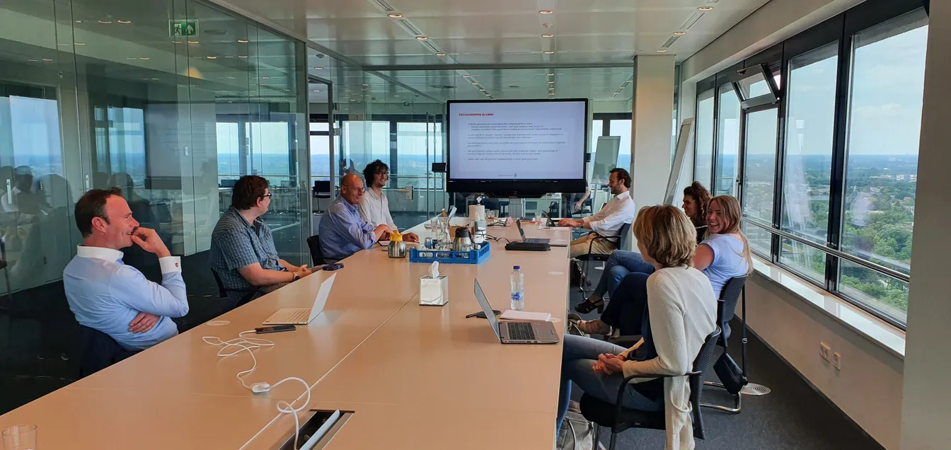
A meeting at Radboud to discuss product features. Their fantastic team took active part in the creation of the product. Plus, at 5:30pm on the dot, we all went to grab a beer. Points for Dutch work culture!
I’m also thankful for how professionally well-rounded this project was. I worked at the crossroads of software engineering, design and business strategy. I also held relations with our first client, Radboud University.
Achievements & current state
Nxus serves two huge Dutch institutions: Radboud University and ROC van Amsterdam. Thousands of students and alumni are on the platform, as well as hundreds of employers. Despite these incredible milestones, we also struggled to scale. We never raised VC funding, and the product did not have the every-day kind of use it needed.
Working within tight business constraints was very hard. I experienced the stumbling blocks (co-)owning a company, and how much energy they can drain. I’m glad I moved on, but I’ll always be grateful for having started out with such a beautiful endeavour.